Logo and design and branding, oh my!
May 29, 2024
I wouldn't say we followed the conventional path. Our approach has been a blend of learning, improvising, and creating as we went along. Designing the logo was an especially cool part of the journey.
Before we even finalized our company name, we began iterating on logo designs. We hoped that a company name would emerge naturally from the logo design process. While it might not be the traditional approach, it certainly yielded results.

Without a clear plan, we began by using AI to generate basic images from various prompts. These images inspired us. While the milk tea aesthetic is typically cute and chibi, we wanted something that stood out within the culture. This led us to explore various animal and boba imagery, ultimately creating a unique concept.

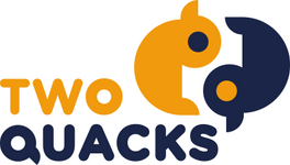
After numerous iterations, we began to solidify our vision. This process led us to choose "Two Quacks" as our company name. The name holds multiple meanings: there are two of us, ducks are inherently cute, and "quack" humorously reflects our initial inexperience. It captures our journey from uncertainty to commitment.
For our logo, we wanted to subtly reference the concept of yin and yang without being too obvious. While many "duck" logos feature mallards or standard white ducks, we used the ruddy duck as our muse. So in way, we're putting the ruddy duck on the map and giving it a unique place in the milk tea culture.


